Making biomechanics simple and accessible with AI
How we used AI and a precision-focused design system to help amateur athletes break through performance plateaus.
My Role
UX Research, UI Design, Interaction
Timeline
2 Weeks Sprint
Platform
Responsive Web App
Tools
Figma, Chart.js, Tailwind
The Challenge: The "Technique Plateau"
Amateur athletes often hit a wall because they lack objective data. We identified three core friction points preventing progress.
Subjectivity
"Does my form look right?" Feedback currently relies on the naked eye, which misses micro-movements and velocity changes.
Accessibility
Professional biomechanics labs cost thousands of dollars. Elite data was gated behind elite paywalls.
Data Overload
Existing trackers show "What" (Heart Rate: 150) but fail to explain "How" (Knee valgus angle: 12 degrees).
Simplifying Kinetic Chain Data
The raw data for performance tracking involves analyzing the kinetic chain, the sequence of body segments creating motion. The challenge was displaying complex joint angles, velocity vectors, and force distribution in a simple, non-overwhelming way.
The system must instantly translate this dense technical information into a clear, actionable Performance Score, which is the core goal of the UI design.

Visual representation of joint rotation and velocity vectors.
The Design System
A minimal, "Dark Mode" vocabulary built for focus and precision.
Color Tokens
Primary Main
Brand Actions, Active States
#6C5DD3
Success Bright
Growth, Positive Trends
#24D69D
Surface Base
Application Background
#0D0E12
Typography & Elements
Display Large
Inter Bold / 32px
Heading Medium
Inter SemiBold / 24px
Body text is set in Inter Regular at 16px for optimal readability against dark backgrounds. We use a slightly taller line-height (1.5) to reduce eye strain.
Interactive Components
SportAI Dashboard
We designed a high-contrast, dark-mode interface that prioritizes actionable KPIs. The goal was immediate clarity in high-stress training environments.
Actionable Insights
Complex biomechanics translated into a simple 0-100 score.
Trend Tracking
Visualizing improvement over time to build motivation.
Try the interactions:
Performance Score
87
+5 pts
Accuracy
92%
+3%
Sessions
24
This month
Recovery
78
Optimal
Performance Trends
Technique accuracy over time
SportAI Dashboard
We designed a high-contrast, dark-mode interface that prioritizes actionable KPIs, directly addressing the "Data Overload" friction point. The dashboard shows immediate progress, while the interactive chart below demonstrates how we handle trend analysis.
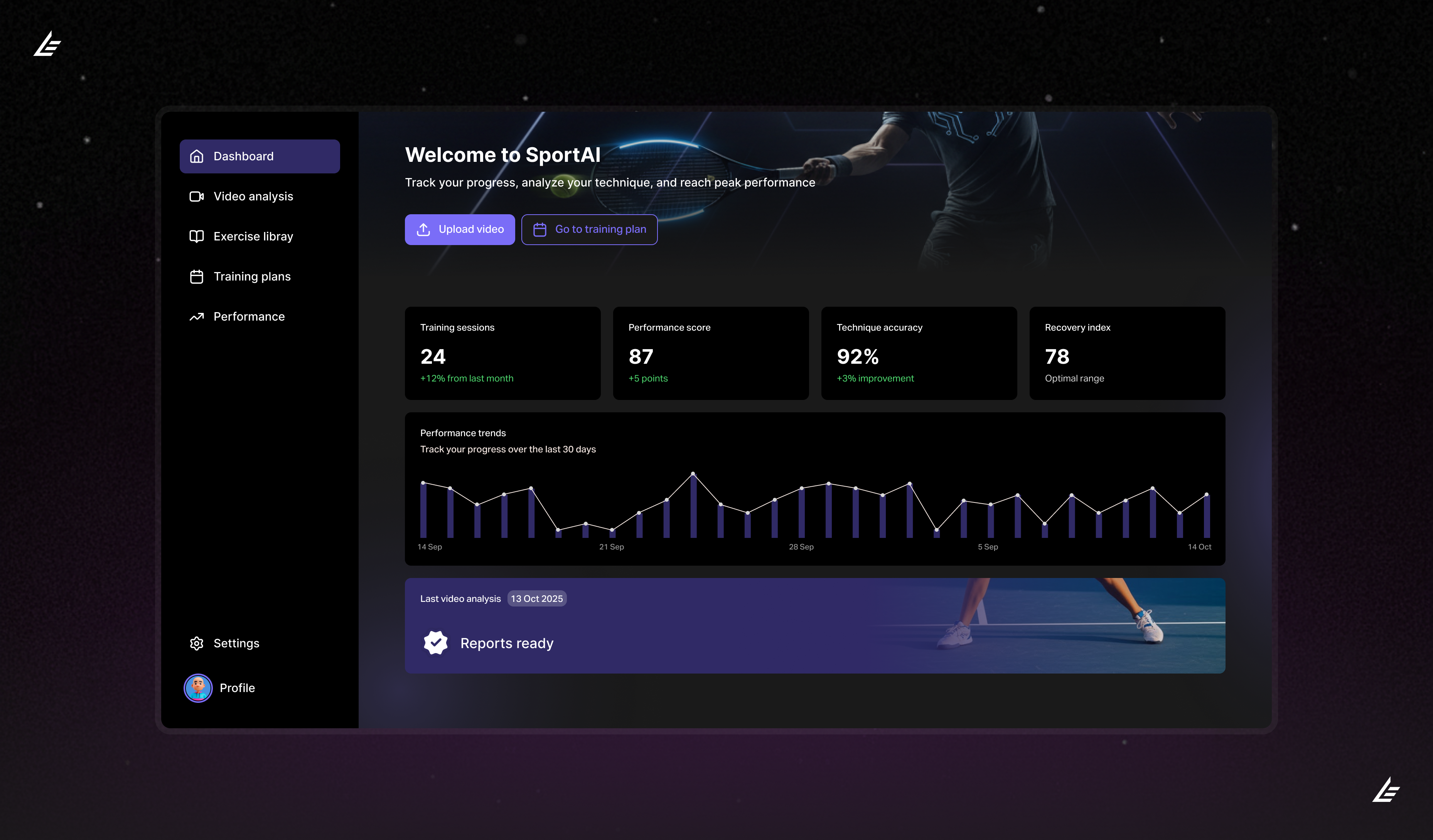
The final UI prioritizing navigation, KPIs, and visual hierarchy.
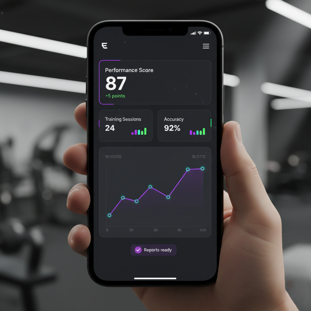
Mobile version of the final UI prototype.
The Outcome
"SportAI successfully bridged the gap between raw data and athlete understanding. The new dashboard allows users to diagnose technique errors in under 30 seconds."